Brand Guide Development & Design Support
OptiRTC
2024
Vertical
Geography
Media Type(s)
Tags
What it is
OptiRTC is a "smart water" company. They sell cloud services to municipalities, public-private partnerships, and governments to help manage flooding and water infrastructure. Their proprietary system pulls from multiple data sources (sensor data, weather, hydrologic models, and others) and runs them through AI that surfaces operational recommendations the people running a city's stormwater system can act on.
What I did
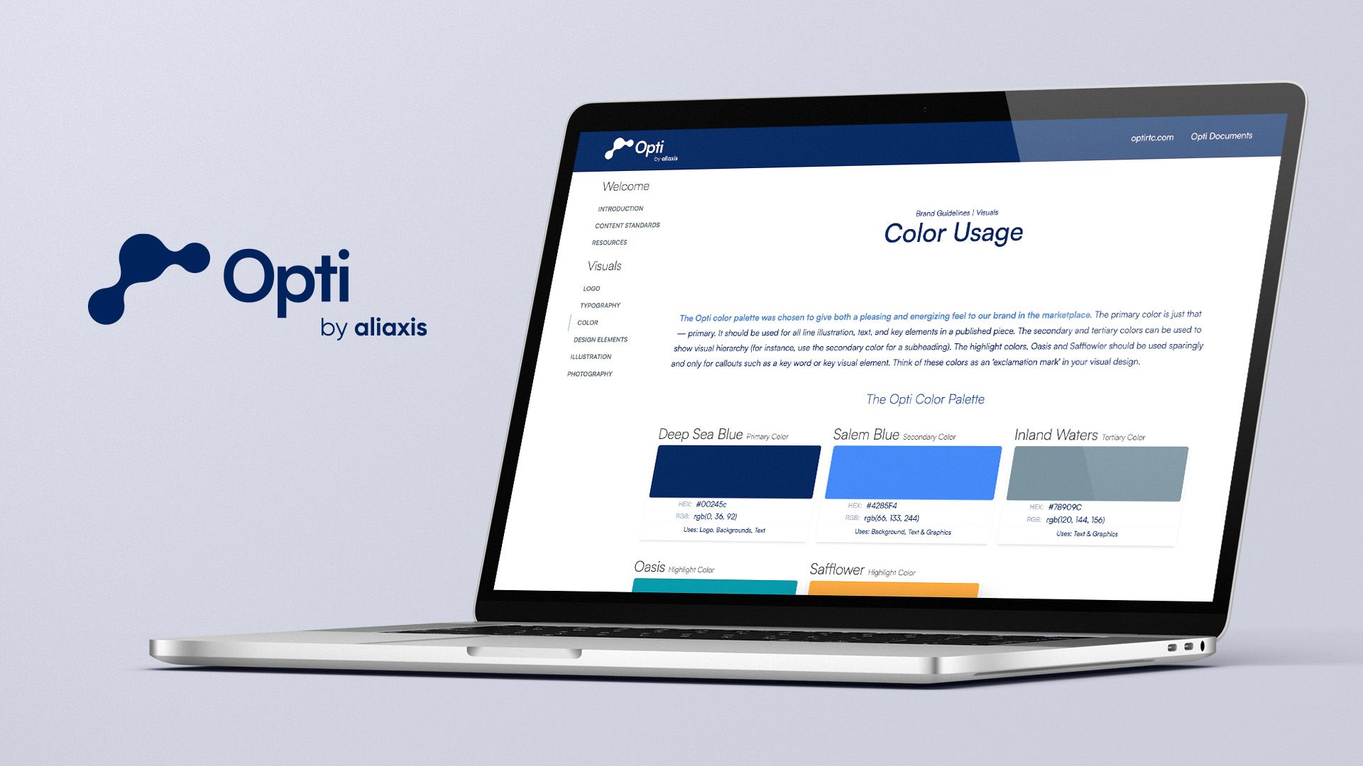
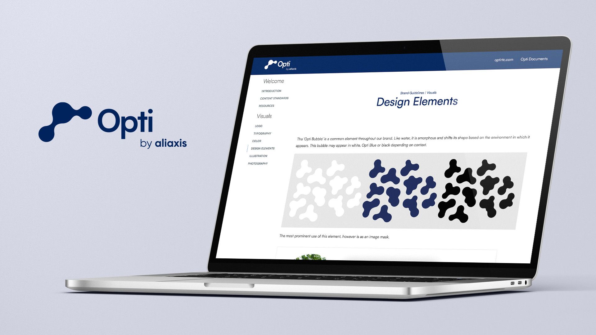
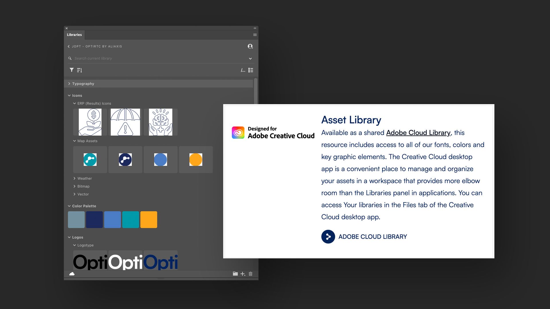
The engagement started with the brand. OptiRTC had accumulated a disparate set of brand elements that didn't quite hang together: variants on the logo, inconsistent typography, color treatments that drifted across decks and the website. The first deliverable was a brand guideline that pulled all of it under one roof: a unified logo system, type scale, color palette, and the rules for using each.
That work became the basis for ongoing design support across the formats a small B2B firm actually ships in the field:
- B2B marketing collateral. One-pagers, case-study sheets, RFP-response templates, and the recurring formats their sales team uses with prospects.
- Presentation design. Decks for sales, partnership briefings, and conference presentations, where the visual rigor compounds across many sessions.
- Web development. Updates and contributions to the optirtc.com property, in the same visual language as the rest.
What's distinctive
Brand work for a small water-tech firm is two problems at once. Internally, it's pulling everything that piled up over the years into one consistent face. Externally, it's standing out in a market that defaults to bland infrastructure-vendor visuals. Both problems share a solution: be specific. Specific enough that the brand stops looking like a generic stormwater consultancy and starts looking like the company that actually has the AI-powered recommendations municipalities want to buy.
That specificity was the brief. The brand guide is the artifact. The marketing materials, decks, and web work are where it earns its keep.